Lo'mshane
Brand Identity / 2026
Brand Identity / 2026
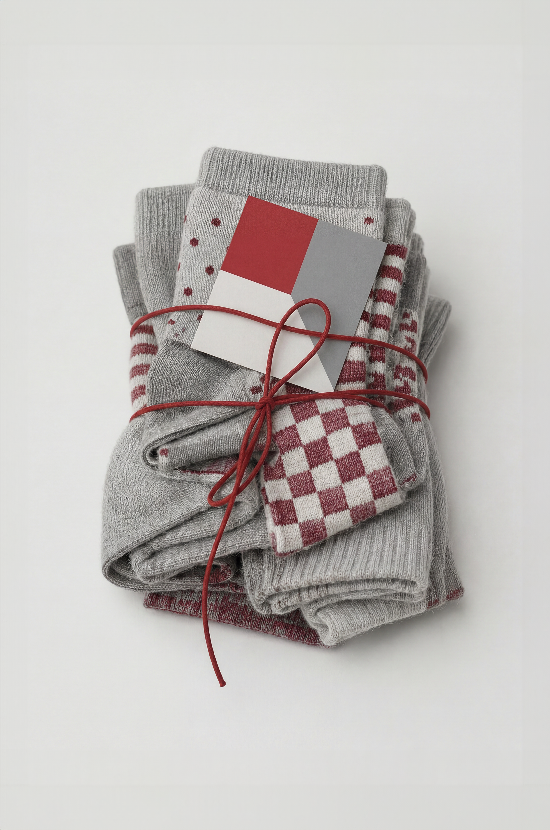
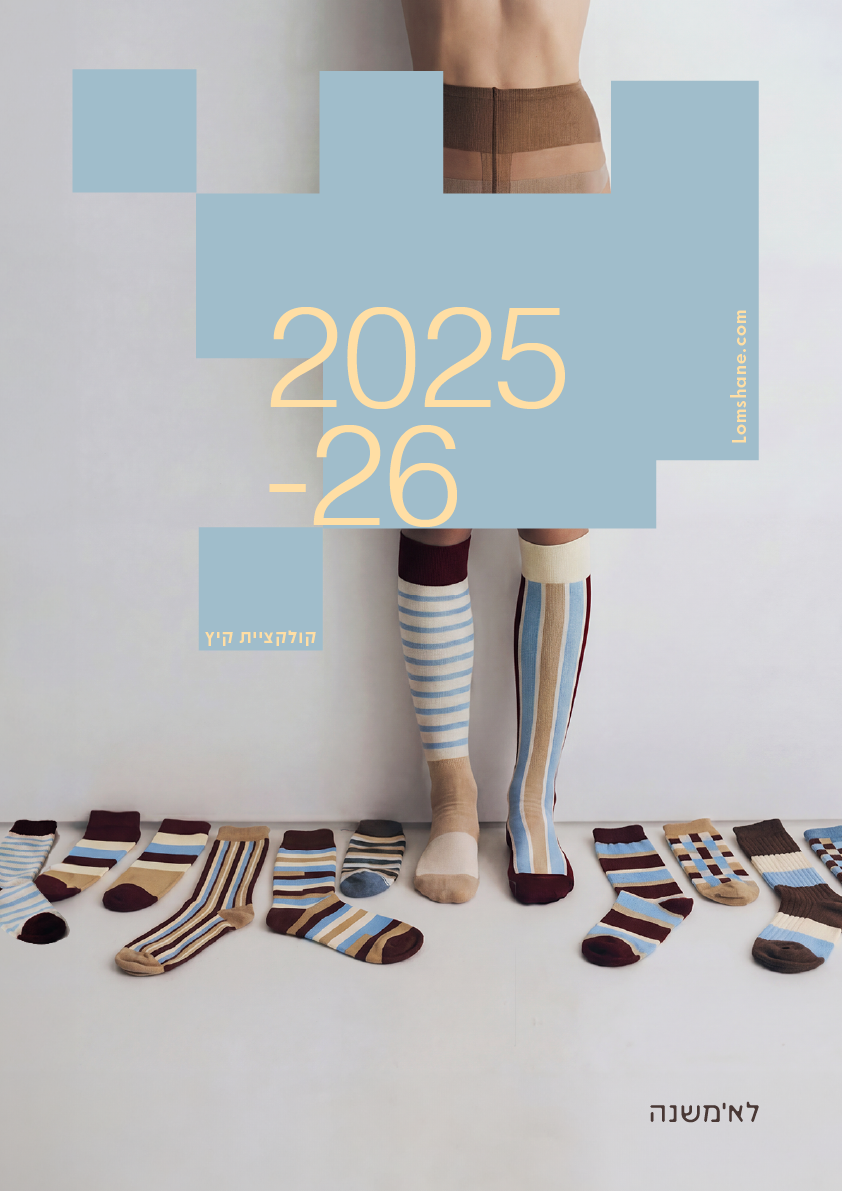
Lomshane is a brand identity for a single-sock brand built around freedom of combination. Instead of selling fixed pairs, the brand allows customers to choose colors, pattern freedom, size, and quantity - creating a box of single socks that each stand on their own, while still belonging to one system. I designed the concept, logotype, pattern system, packaging, website, social content, tote bag, postcards, and campaign visuals. The visual language combines neutral kraft packaging, bold geometric symbols, colorful textile patterns, and a playful but minimal ordering experience. AI tools were used throughout the process for visual research, image generation, video generation, motion tests, mockups, copywriting, and website planning.
Tools [Illustrator, Photoshop, Figma, Kling, Veo 3, Runway, Midjerny]
Tools [Illustrator, Photoshop, Figma, Kling, Veo 3, Runway, Midjerny]

Brand Applications
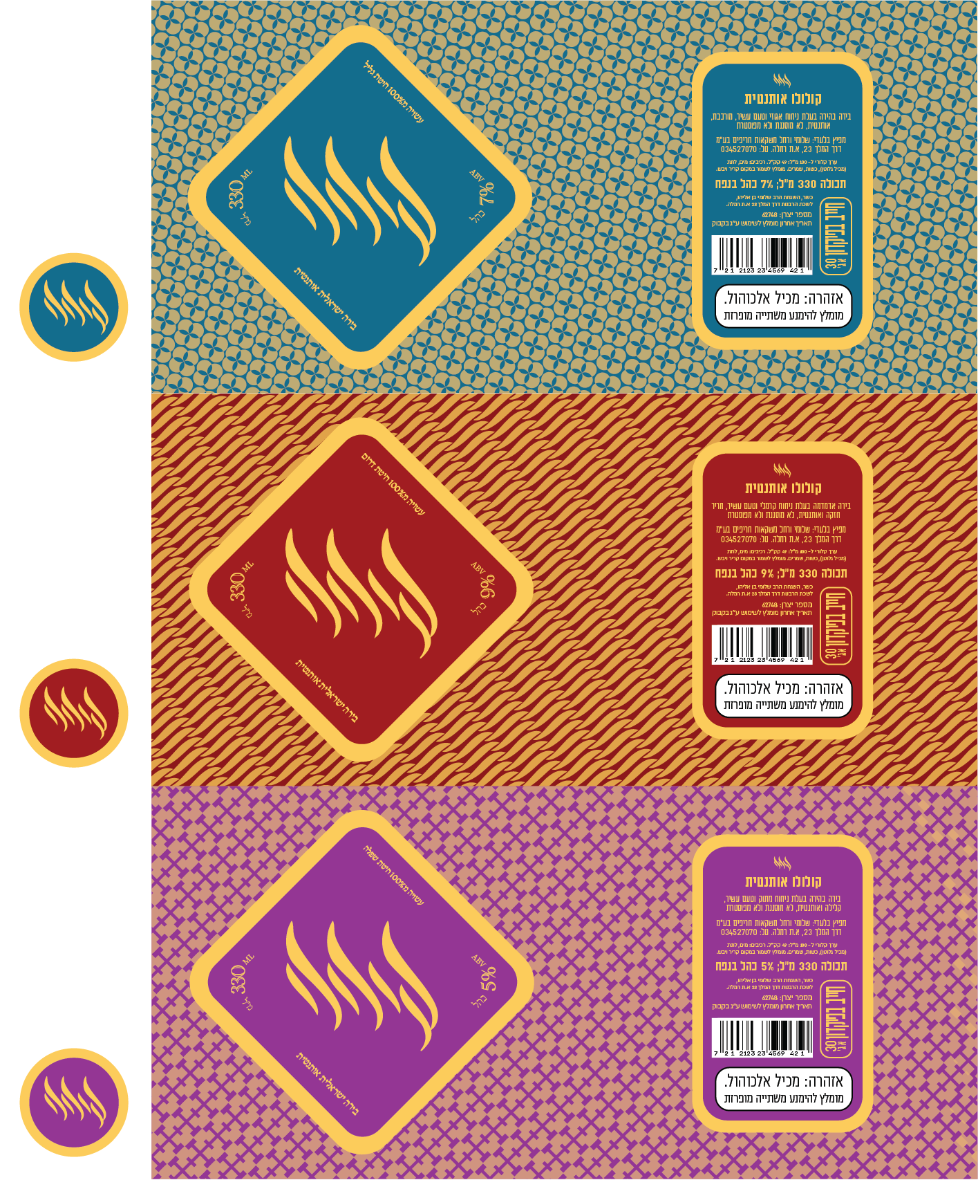
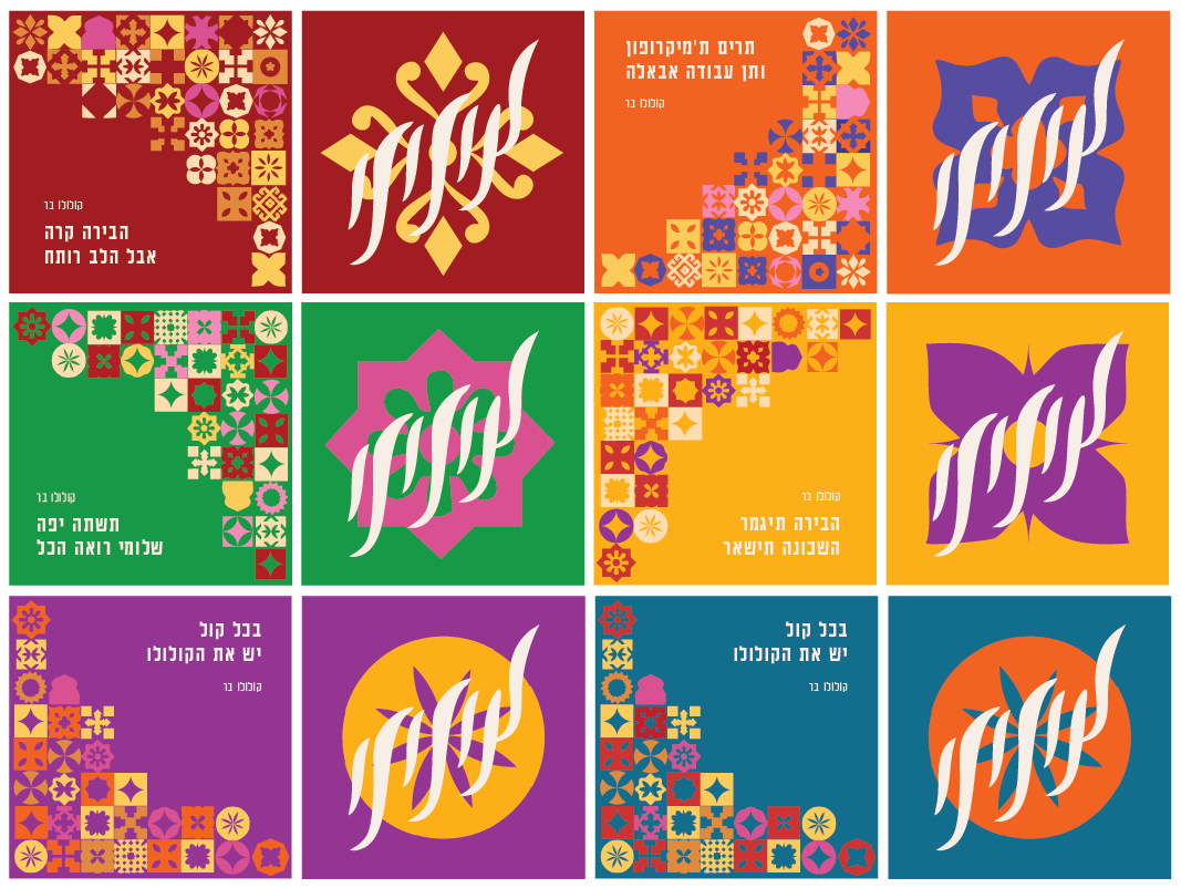
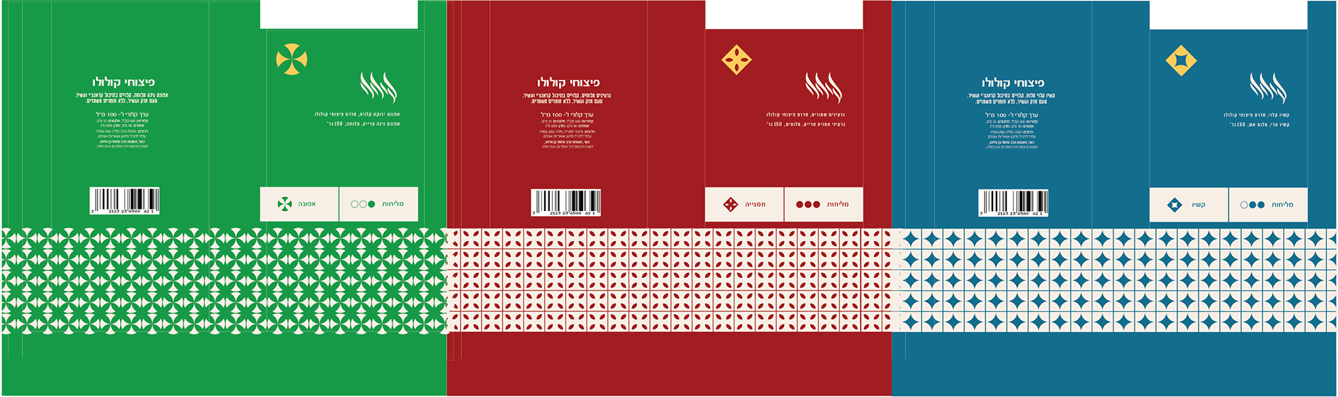
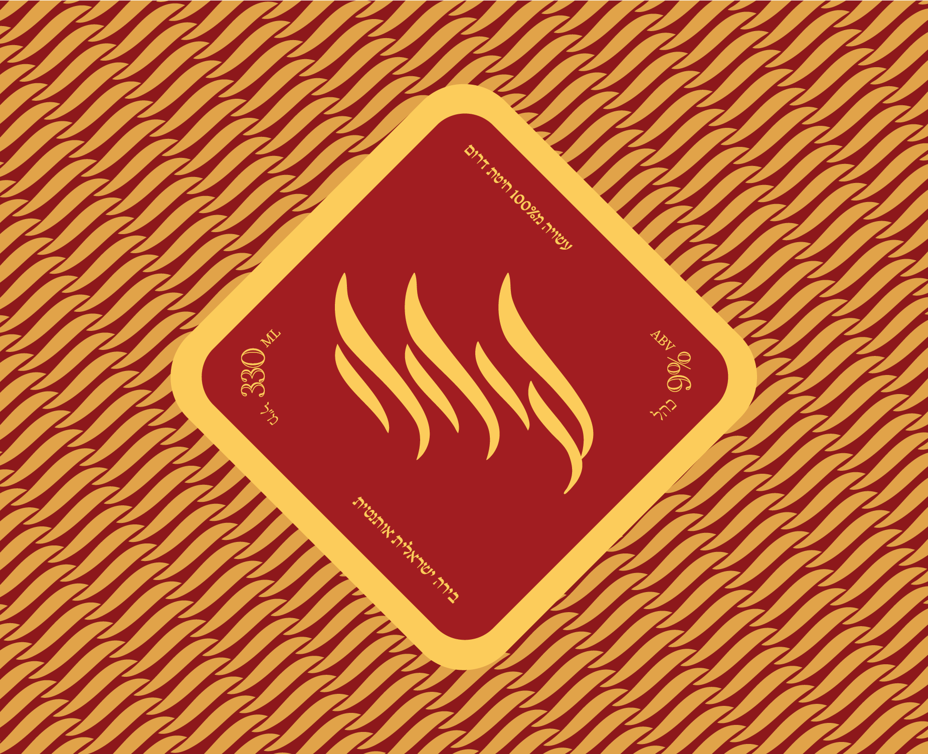
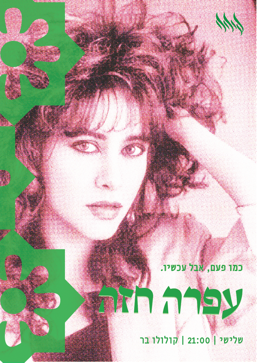
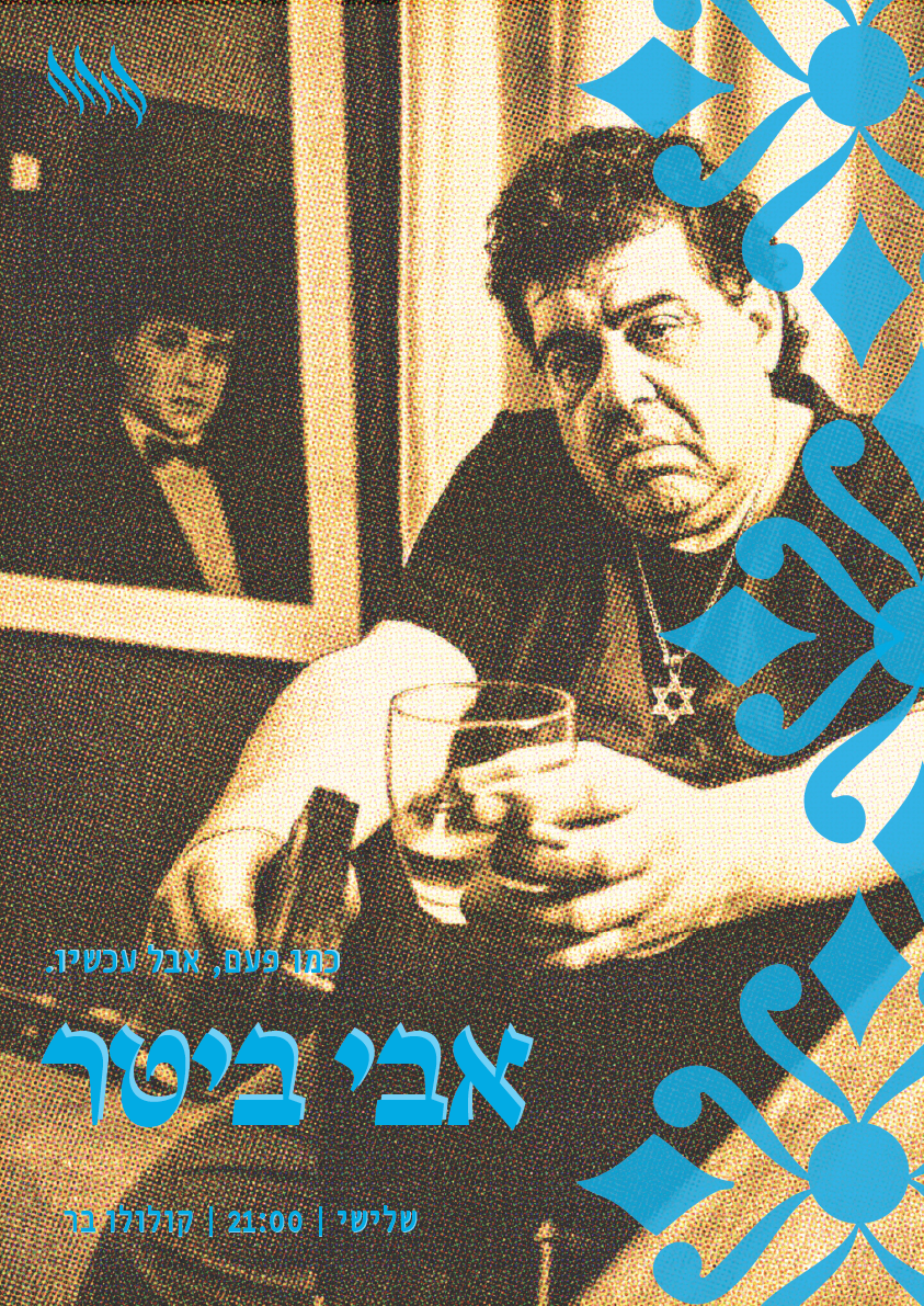
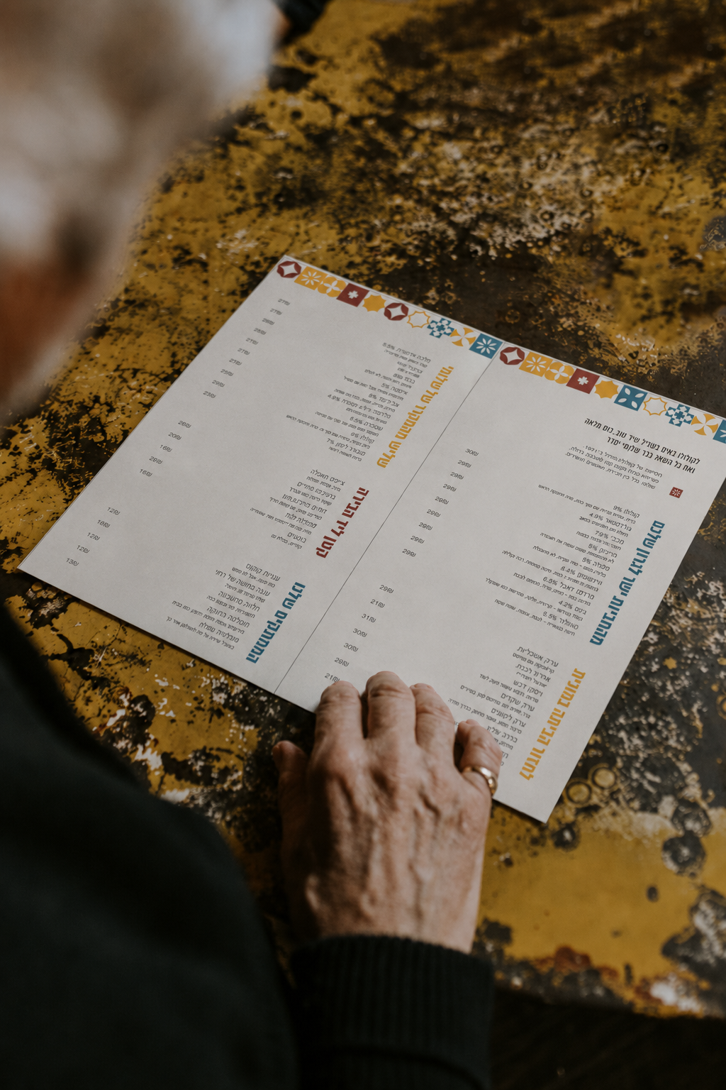
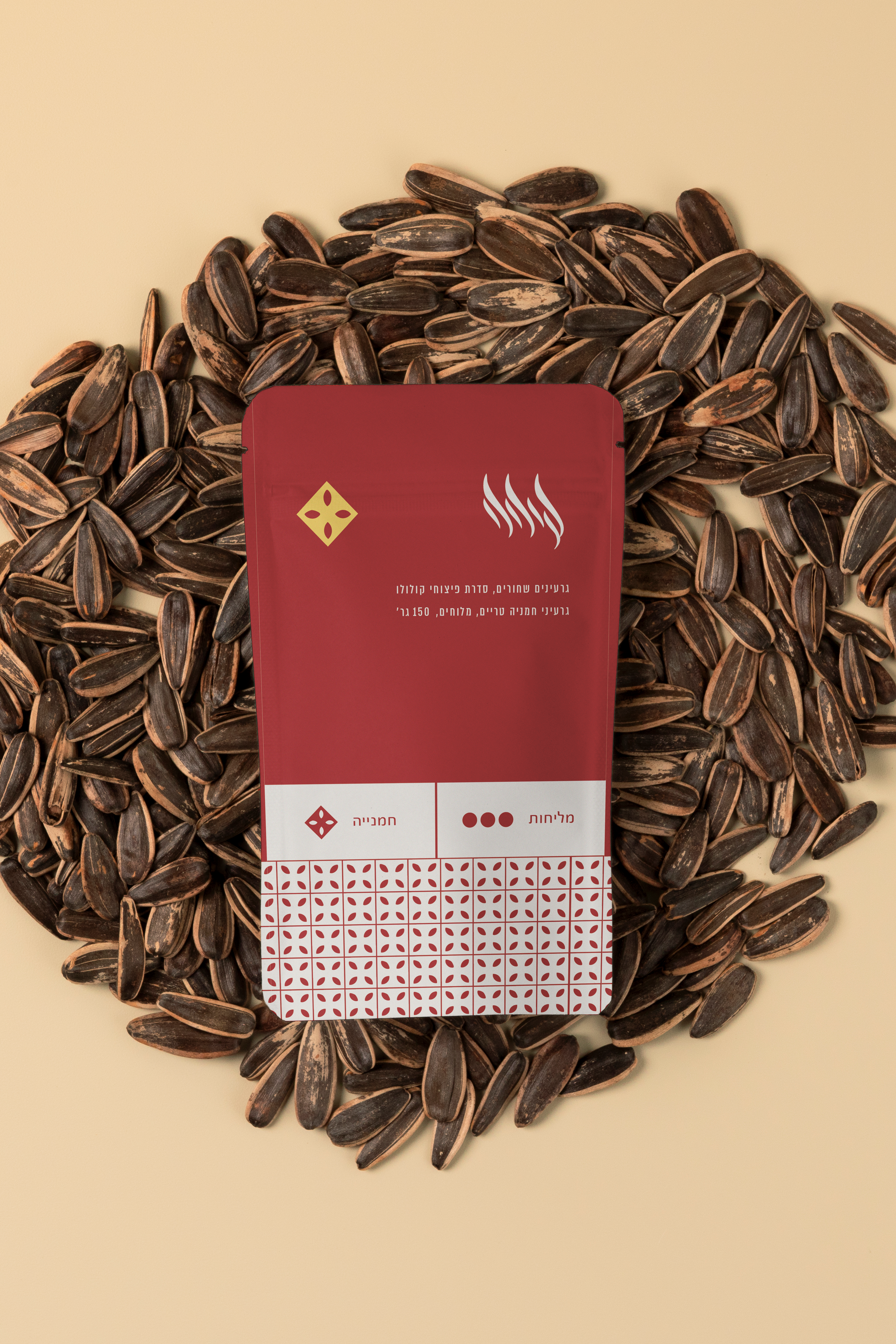
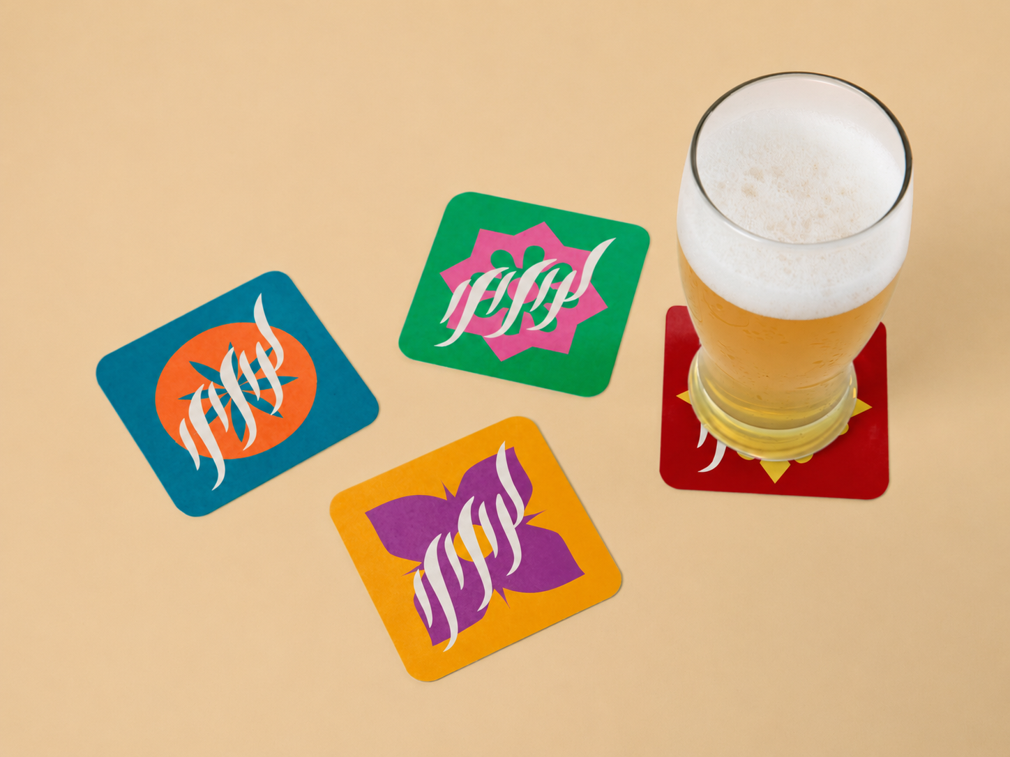
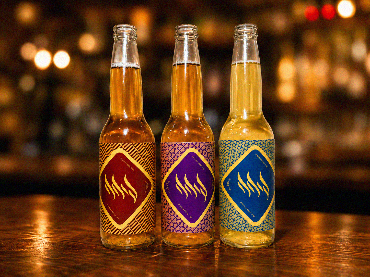
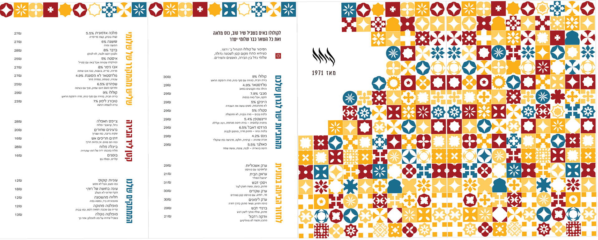
The identity was applied across posters, packaging, coasters, beer labels,
and a printed menu, creating a flexible system for different touchpoints of the bar.
and a printed menu, creating a flexible system for different touchpoints of the bar.

Brand Story
The brand story was written as part of the identity, giving Kululu a local voice: informal, warm, humorous, and slightly chaotic. The menu became more than a list of drinks- it helped define the character of the place and the people around it.
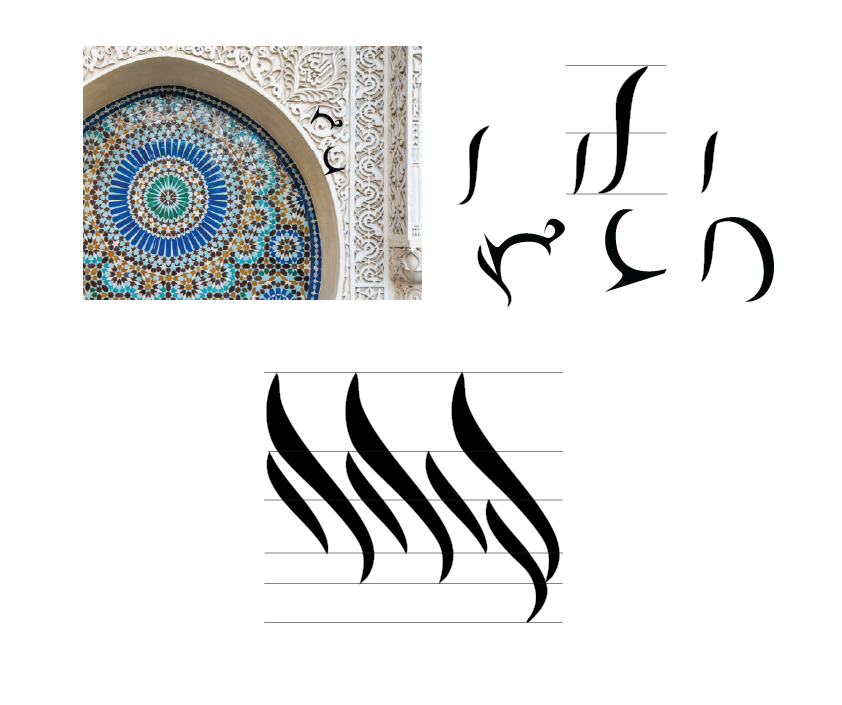
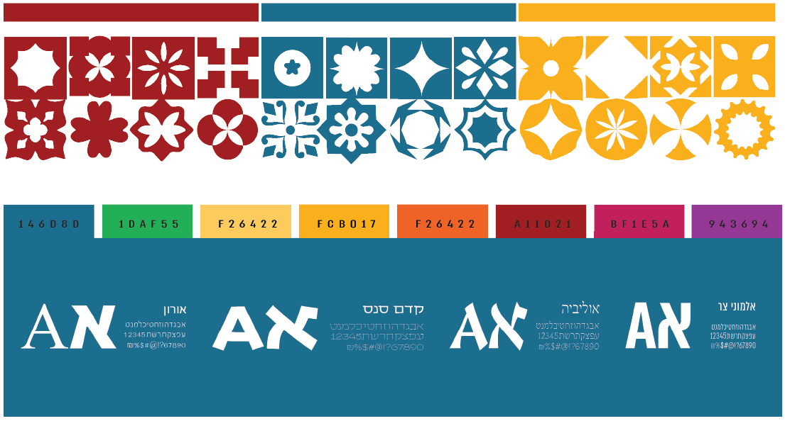
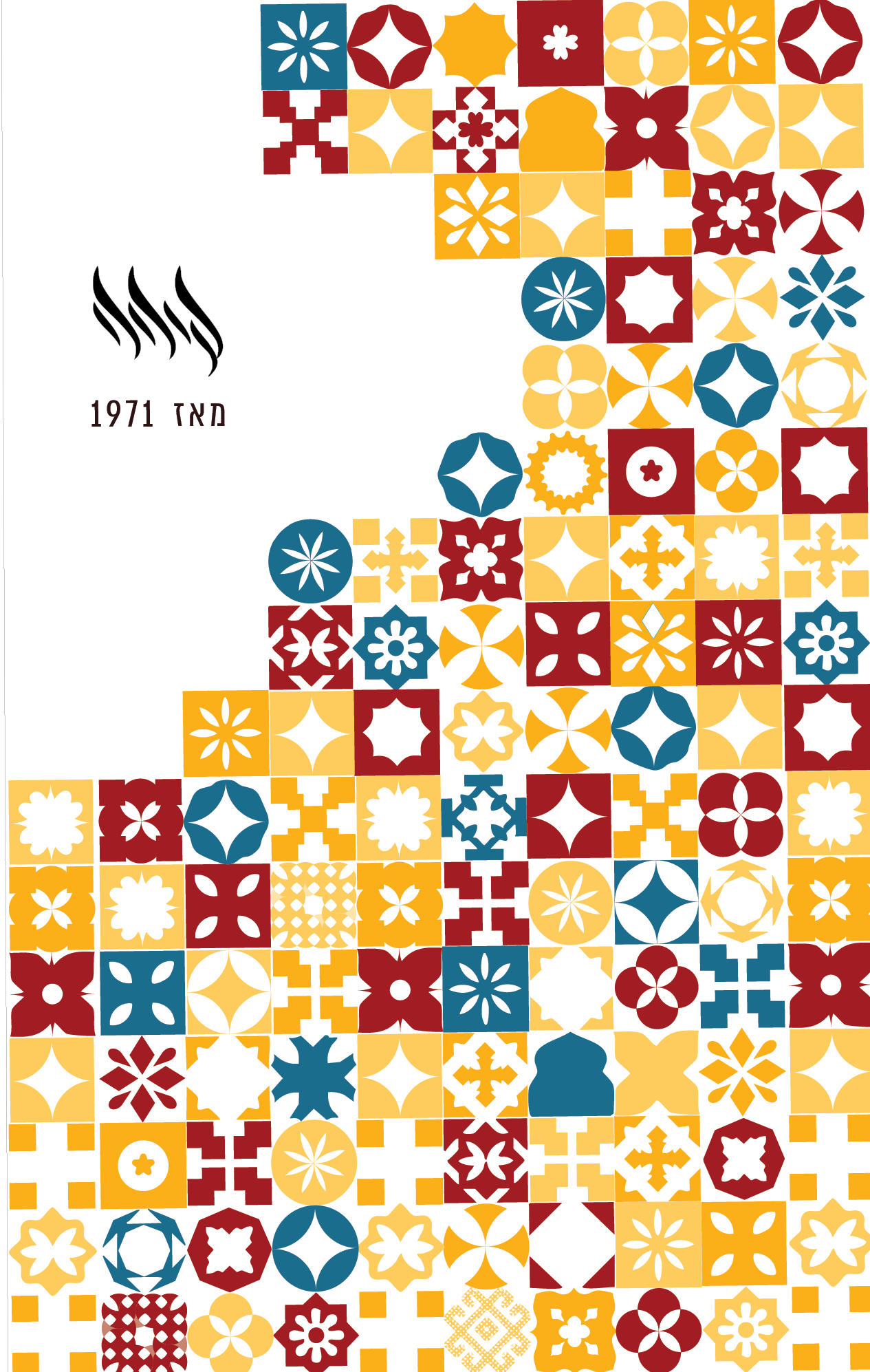
Visual Language & Logotype